Every new venture starts with an idea. But what to do with it next and how to turn a simple idea into a full-fledged service for traders and brokers? There are many nuances, and the development process of any software has stages that need to be passed to make the software modern, convenient, and attractive to customers. In particular, software for traders should have a high-quality UX design and be as user-friendly as possible. This article will explain what UX is and how to build a high-quality design for your application.
What is UX design, and why is it important in development?
The abbreviation UX stands for User Experience. This branch of design is responsible for designing the user experience in your software. In particular, the UX design of a trading app takes into account the following aspects:
- Development of the user flow from the initial entry point to the target action.
- Design of screens and arrangement of elements on them.
- The color scheme and the color ratio of elements to each other.
- Development of a convenient menu, header, and footer.
- Design of popups, inaps, informational messages, and other small software elements.
And much more.
What is the difference between graphic design? These two concepts should really be distinguished. In short, it will be most convenient to understand everything with an example. Let’s imagine we have a trading application — software for a user’s smartphone. The appearance of the software, the sequence of user actions, screens, and the location of buttons and elements — all of this is the responsibility of a UX designer. But banners on the home page, images for informational messages, a logo, and other purely visual elements are tasks that a graphic designer usually handles. A UX designer is more likely to use programs like Figma or Sketch. Still, a graphic designer will work with programs like Adobe Photoshop, Adobe Illustrator, InDesign, and other similar software. Of course, there are universal specialists, but the responsibilities are often clearly divided.
Great examples
We favor a practical approach, so we collected a few examples of tools for traders with a well-thought-out UX design. Why do you need it? As the famous book advises: steal like an artist. That is, you can use the experience of your competitors and look at their structure to develop your app for traders. The main thing is to avoid repeating everything 1-in-1 100% because this will be plagiarism. Your users are unlikely to want to use software that completely replicates the look and functions of software that already exists on the market.
So, we have collected the following examples:
- Webull
This platform is an excellent example of a high-quality application of the mobile-first methodology. This methodology is rapidly spreading worldwide. Its primary meaning is that it is worth creating a mobile version of the software first and then moving on to the desktop version. Why is this so? First, recent studies show that the share of mobile users far exceeds those who use desktops, and this gap is growing. Secondly, using this methodology simplifies the process of creating the design as such and changes the approach to it. Since a mobile device has a smaller screen, it’s more efficient to think about the arrangement of elements first than to try to fit information from a desktop into a small smartphone screen.
In addition, Webull has the following features:
- Two-step login, which is both easy and fast, and at the same time does not pose any security risks to the user.
- It has the option of notifications and alerts, which is critical in trading. That is, a person can customize notifications about changes in the market depending on which indicators they are interested in.
- The software is available for three types of devices at once: Android smartphones, iOS smartphones, and iPads,
- Webull has a reasonably intuitive yet simple interface that is not overloaded with unnecessary elements. Since trading has many metrics and indicators that help people fulfill their tasks, a minimalistic, clear interface is a must-have for such software.
- Tastyworks
This software is an example of high-quality UX in applications used by advanced traders. It has the following advantages:
- Possibility of identification via Touch ID and Face ID. This speeds up the login process for regular users.
- A chat widget allows you to contact support quickly and get answers to your questions.
- The application can be moderately customized to the needs of the client.
Customization is one of the most important trends in modern trading software.
- Fidelity.
A universal app for both beginners and advanced traders, Fidelity is a well-known name in the investment community. The high-quality UX and its wide range of features and capabilities are just some reasons for this fame.
We would like to mention at least the following advantages:
- A rather unusual but handy feature is the ability to take notes. You may be surprised, but this can be an indispensable tool for a trader’s work.
- An extensive list of devices on which the app is available. We are talking about Android, iOS, Apple Watch, Android TV, and even Amazon devices. It means a person will have access to the necessary tools from almost any device.
- News feed functionality helps to track market trends and predict their fluctuations.
And, of course, these apps perfectly follow all the laws of UX design and have done an excellent job of ensuring that the software meets the so-called 10 Nielsen heuristics. These heuristics are a checklist that helps to check the software for usability and determine where to change or improve something.
What does the process consist of?
When planning software development for traders, UX design should be started even before the process of writing code. For this purpose, you will, of course, need a UX designer. What will this work consist of? There are several main stages:
- Research. It’s not an obvious fact: the lion’s share of a UX designer’s work is not to draw screens in Figma but to analyze competitors, communicate with users, conduct heuristic analysis, quantitative and qualitative surveys, etc. Why: Only qualitative research can help you understand the behavioral patterns of your target audience and create a high-quality design based on these patterns.
- Design process. Based on the data obtained in the research, the designer will create the screens for your future application. This applies to the color scheme and the arrangement of all elements, thinking through the complete user flow with all branches, and so on. The main task is to guide the user through the flow as seamlessly and simply as possible so that the user does not have any questions like “Where should I click to get the desired result?”. Everything should be intuitive.
- Repeated research. After the MVP’s release or some new feature in production, you should conduct repeated research. This is to check whether the team’s hypotheses during the design development were confirmed. It also helps to improve the user experience and achieve the highest possible usability in your app.
Who can help you create a trading app with a high-quality UX design?
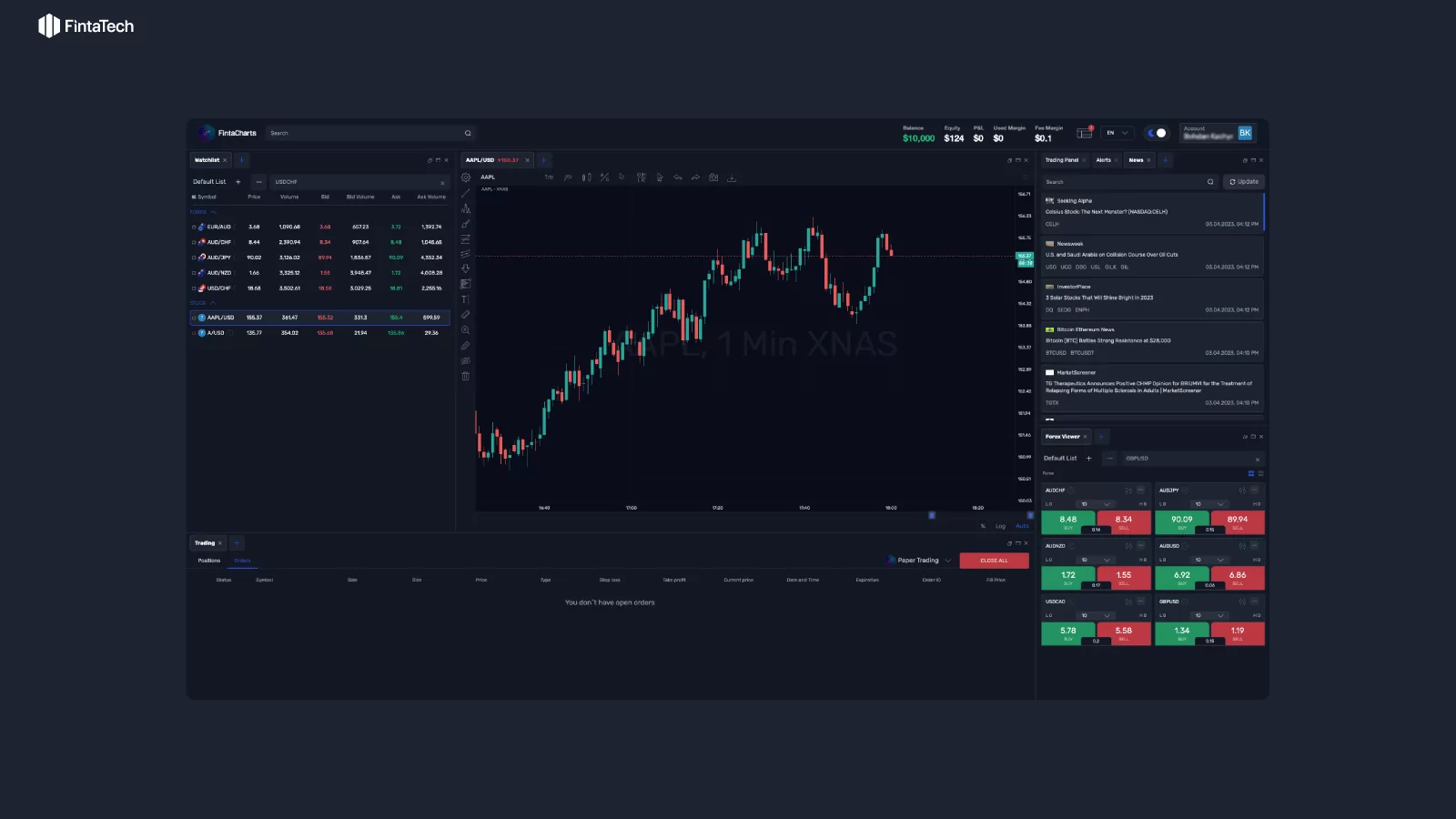
If you are looking for a company that can create a high-quality UX design for a trading app, we recommend contacting Fintatech. We have extensive experience working on apps for traders and brokers, and our team of UX designers will be able to create a design that will consider both your wishes and the needs of your target audience.
You can find examples of our work on our website. To talk about your project in more detail, sign up for a consultation. We will be happy to find the perfect solution for you! And after that, we will be ready to take on the design and development of the trading platform.



Twitter
Linkedin
Facebook